Media Queries - A Responsive Responsibility
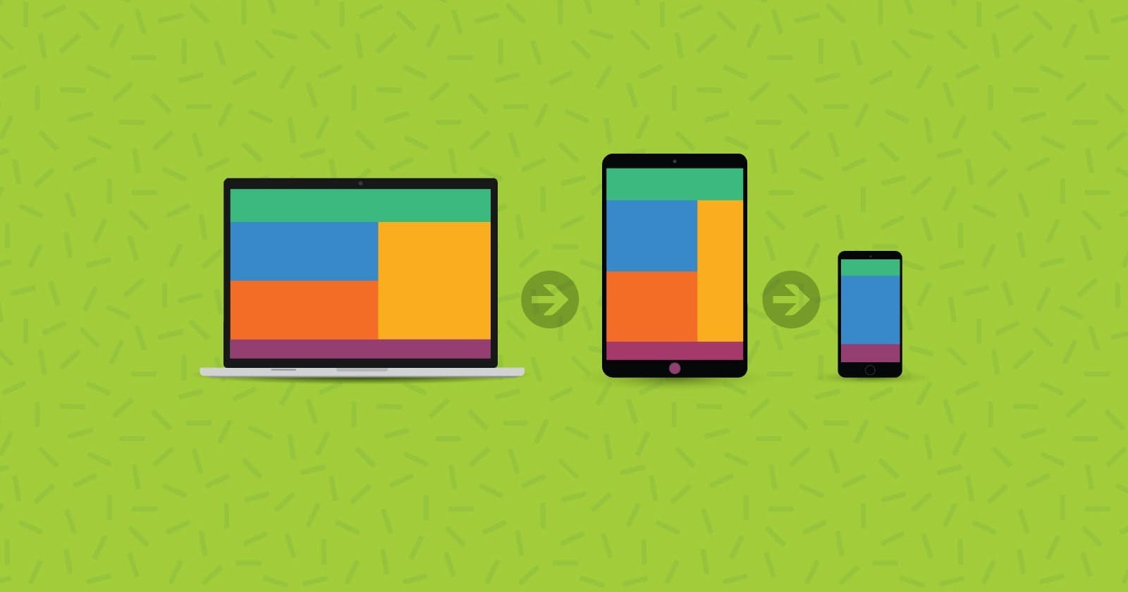
You can make your web page more responsive so that it runs on all devices.


Table of contents
Introduction to CSS
Cascading Style Sheet(CSS) is a stylesheet language used to describe the presentation of a document written in HTML. CSS describes how elements should be rendered on screen.
CSS is among the core language of the open web and is standardized across web browsers according to W3C specifications. Previously, the development of various parts of CSS specification was done synchronously, which allowed the versioning of the latest recommendations. You might have heard about CSS1, CSS2.1, or even CSS3. There will never be a CSS3 or a CSS4; everything is now CSS without a version number.
Introduction to Media queries
Media query is a CSS technique introduced in CSS3. This allows you to apply CSS styles depending on a device's general type ( such as print vs. screen) or other characteristics such as screen resolution or browser viewport width.
Syntax
A media query is composed of an optional media type and any number of media feature expressions, which may optionally be combined in various ways using logical operators.
Media types: It defines the board category of the device for which the media query applies:
all,print,screen. The type is optional.allSuitable for all devices
printIntended for paged material and documents viewed on a screen in print preview mode
screenIntended primarily for screens
```css
@media print{
}

@media screen{
}
```
Media features: It describes specific characteristics of the user agent, output device, or environment:
aspect-ratio:The width-to-height aspect ratio of the viewportcolor:Number of bits per color component of the output device, or zero if the device isn't colorcolor-index:Number of entries in the output device's color lookup table, or zero if the device does not use such a tablegrid:If the device uses a gridheight:Height of the viewportwidth:Width of the viewportorientation:Orientation of the viewportany-hoverany-pointercolor-gamutdevice-aspect-ratiodevice-heightdevice-widthdisplay-modedynamic-rangeforced-colorshoverinverted-colorsmonochromeoverflow-blockoverflow-inlinepointerprefers-color-schemeprefers-contrastprefers-reduced-motionresolutionscriptingupdatevideo-dynamic-range@media (hover: hover){ } @media (max-width:1024px){ } @media (color){ }
Logical operators: They can be used to compose a complex media query:
not,and, andonly. You can also combine multiple media queries into a single rule by separating them with commas.notUsed to negate a media query, returning
trueif the query would otherwise returnfalse. If present in a comma-separated list of queries, it will only negate the specific query to which it is applied. If you use thenotoperator, you must also specify a media type.andUsed for combining multiple media features into a single media query, requiring each chained feature to return
truefor the query to betrue. It is also used for joining media features with media types.onlyApplies a style only if an entire query matches. It is useful for preventing older browsers from applying selected styles. When not using
only, older browsers would interpret the queryscreen and (max-width: 500px)asscreen, ignoring the remainder of the query, and applying its styles on all screens. If you use theonlyoperator, you must also specify a media type.,(comma)Commas are used to combine multiple media queries into a single rule. Each query in a comma-separated list is treated separately from the others Thus, if any of the queries in a list is
true, the entire media statement returnstrue. In other words, lists behave like a logicaloroperator.
```css
@media (min-width: 30em) and (orientation: landscape) {
}
@media screen and (min-width: 30em) and (orientation: landscape) {
}
@media (min-height: 680px), screen and (orientation: portrait) {
}
@media not screen and (color), print and (color) {
}
```
Example:
<!DOCTYPE html>
<html lang="en">
<head>
    <meta charset="UTF-8">
    <meta http-equiv="X-UA-Compatible" content="IE=edge">
    <meta name="viewport" content="width=device-width, initial-scale=1.0">
    <link rel="stylesheet" href="media.css">
    <title>Media Queries</title>
</head>
<body>
    <div class="primary">
        <div class="secondary1"></div>
        <div class="secondary2"></div>
    </div>
</body>
</html>
.primary{
    border: 2px solid #000000;
    background-color: #808080;
    display: flex;
    align-items: center;
    justify-content: center;
}
.secondary1,.secondary2{
    height: 20px;
    width: 20px;
    border: 2px solid #ffffff;
    padding: 20px 30px;
    margin: 5px;
    background-color: #000000;
}
@media (max-width:1024px) {
    .primary{
        margin: 5px;
        background-color: #a81ec4;
    }
    .secondary1,.secondary2{
        border-radius: 50%;
        background-color: #0e136f;
        margin: 3px;
    }
}
@media (max-width:900px) {
    .primary{
        margin: 5px;
        background-color: #23eb15;
    }
    .secondary1,.secondary2{
        background-color: #0fc6d3;
        margin: 3px;
        border-radius: 0;
    }
}
@media (max-width:650px) {
    .primary{
        display: flex;
        flex-direction: column;
        margin: 5px;
        background-color: #b4c41e;
    }
    .secondary1,.secondary2{
        background-color: #6f2a0e;
        margin: 3px;
        border-radius: 50%;
    }
}
@media (max-width:480px) {
    .primary{
        display: flex;
        flex-direction: column;
        margin: 5px;
        background-color: #000000;
    }
    .secondary1,.secondary2{
        background-color: #808080;
        margin: 3px;
        border-radius: 0%;
    }
}
GO AND WORK ON THIS EXAMPLE WITH YOUR EDITOR.
You can see four types of screen differences here.
Note: If you did not find it, just leftclick>inspect> dimension>responsive then adjust the width pixel or simply drag the screen.
For like this more code star at: https://github.com/Prajwal-V-Naik?tab=repositories
For everyday updates connect at: https://www.linkedin.com/in/pajju-dev-8431withyou/
"Learn to start"
"Happy learning"